MAKESHIFT TO MAKEOVER: A BY THE NUMBERS BREAKDOWN
We’re on a mission, my stylish friends, to help our clients undo those makeshift spaces that cropped up in their homes during the pandemic. For too many of us, these “temporary” solutions have now become the new (cluttered) normal.
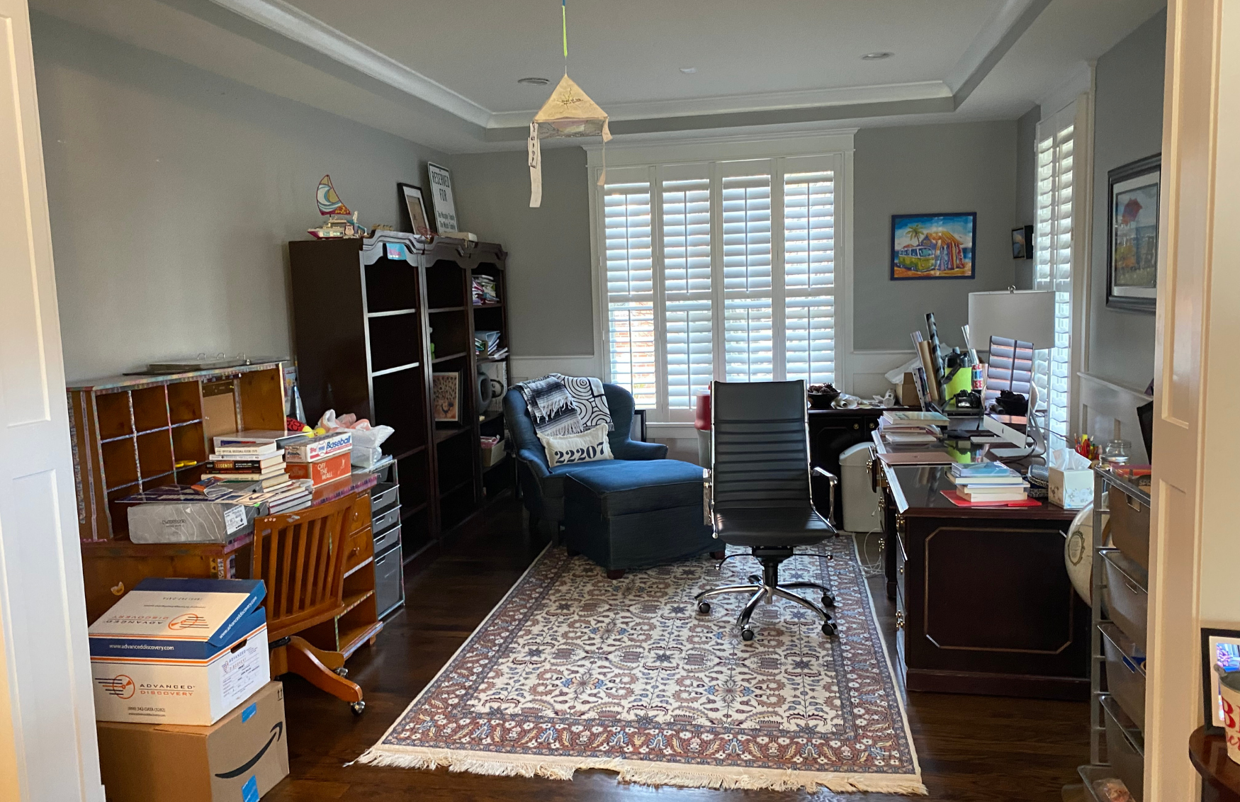
Our client’s living room had evolved into a home office which then shifted into an onsite storage unit. It was filled with unwanted furniture, bankers’ boxes stuffed with who knows what, and piles of gently used items looking for another home. She had had enough. Time to hit the “Serenity Now” button (which conveniently links to the Manlove and Company Interiors Room Rescue Hotline).
This room in question is the very first space you see when entering our clients’ home. Not the first impression they wanted to make for their guests. It was time to get excited about their home again and our team couldn’t wait to make it happen.
Photo by @radiferaphotography
We presented a plan to create a combination office and lounge for our client to work and to entertain. When the workday was done, she could host her girlfriends over a glass of wine in a space especially made for her.
Here’s the “by the numbers” breakdown on how we designed a space that minimized the office feel and provided our client with a smooth transition from work to relaxing.
1. CEILING FIXTURE: We selected a stunning ceiling fixture with an antique brass finish and 20-handmade glass panels for an impactful first impression. We repeated the metal accents in several elements in the space for some glammy continuity.
2. TRAY CEILING: We painted the ceiling to create drama and enhance the ceiling light fixture. We chose Benjamin Moore Aegean Teal (2136-40), to be exact. We love how this blue-green teal has a slight hint of gray.
Photo by @radiferaphotography
3. ARTWORK: We sourced an oversized abstract landscape print to create visual impact the moment you walk in. It tells us “this is the place!” The artwork palette is the perfect complement to the teal ceiling.
Photo by @radiferaphotography
4. WINDOW TREATMENTS: We used decorative fabric panels in a graphic dusty rose print to add energy and attitude to the room. We love how the panels soften the hard lines on the clients existing shutters and wainscotting.
Photo by @radiferaphotography
5. CHAIRS: Contrasting back fabric in a graphic key pattern takes these super-streamlined lounge chairs to the height of fashion. We enjoyed playing with our fabric mix in this project. Customizing furniture adds personality and style to any room.
Photo by @radiferaphotography
6. PILLOWS: Bespoke details show intention and create beauty. Subtle accents of pattern and trim speak volumes to create a luxurious setting. The pillows matter, so we make them a part of every room we design.
Combining an office into any living space can prove challenging to keep the space not too “officey” and cold, while still being a functional workspace. Blending elegant elements with softer furnishings minimizes the office feel and eases the transition from work to relaxing. This room went from being under-used to serving double-duty in this home!
Photos by @radiferaphotography
Does your home have you reaching for the “Serenity Now” button? We can help. Take a minute to complete our Design Survey and we’ll schedule a complimentary Discovery Call to discuss the possibilities.


